Problems Reported by Department of Defense
Of all pilot fatalities resulting from incidents involving weather, 85% could be avoided with faster and more accurate weather reporting.
99% of weather reporting errors are due to human error by way of inaccurate manual aggregation of source model data by forecasters.
Flight accidents involving rapidly evolving inclement weather scenarios result in costs that exceed $2 million annually.
Problems Reported by Air Force Weather Squadrons:
The current process for issuing mission-specific weather reports and alerts to pilots is outdated and fragmented across all squadrons and involves a slow and human-error prone process of copying and pasting data from multiple data models into excel spreadsheets.
This outdated forecasting process makes it extremely difficult for forecasters to support pilots with accurate and timely data and introduces avoidable risk during inclement and rapidly evolving weather.
A highly usable and standardized weather data aggregation and reporting system is necessary to ensure pilot safety during advanced flight missions common to the modern-day military.
Research
Prototyping
Testing
Refinement
Hand-Off
Forecaster Interviews & Heuristic Observation
To kick off the research phase I conducted a UX Interview and Heuristics Study with 20 Air Force forecasters from US weather squadrons (both domestic and international). The high-level discovery goals were summarized as follows:
Understand the current forecast generation process, steps involved in building the forecast, and identify all pain points and gaps related to the outdated tool set and areas where human error is being introduced.
Document all standard, conditional and supplemental data as well as the model and source of all weather data required to support all forecast scenarios.
Uncover all potential mission scenarios and requirements that impact the forecast information and data (mission type, aircraft type, multiple locations, etc).
Investigate standard delivery method to pilots as well as pilots/DoD's forecast-output format expectations and requirements (and whether these conflict and for what reasons).

Data Mapping
Throughout the interview process I gathered intel on the data and data sources required for building forecasts. The initial data map below evolved throughout the initial prototype testing phase as I gathered more specificity regarding data model reliability and prioritization across squadrons.

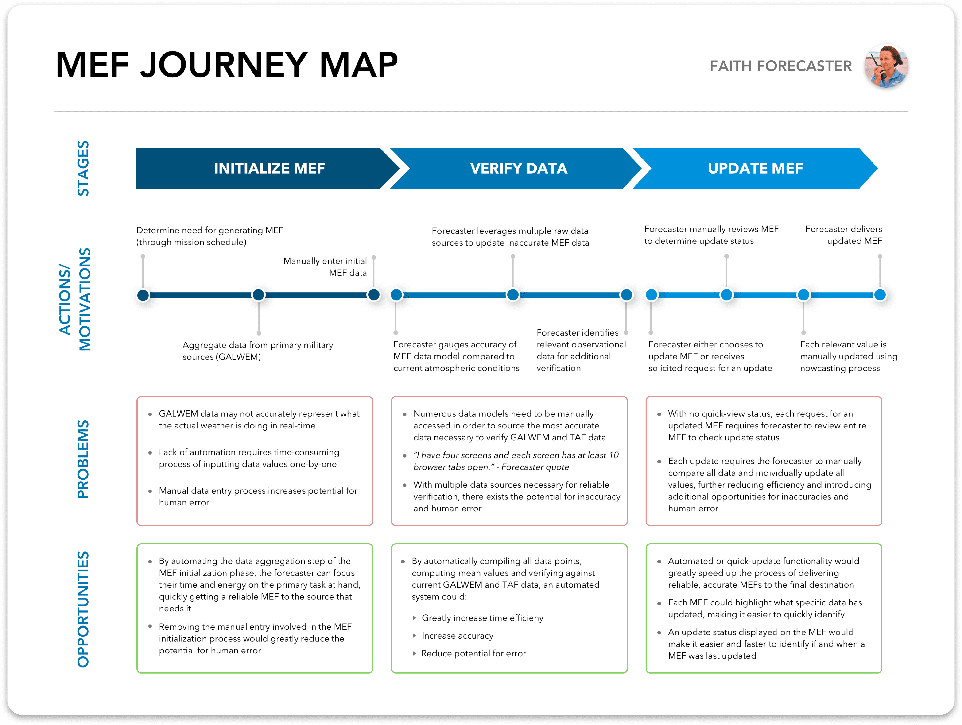
Journey Mapping
I created the Forecast Journey Map shown below in order to contextualize the problems and opportunities I discovered related to each process and stage of the forecast creation and validation process. This map served as a powerful reference point to focus and prioritize design decisions as well as summarize the research findings for the internal team and external DoD stakeholders.
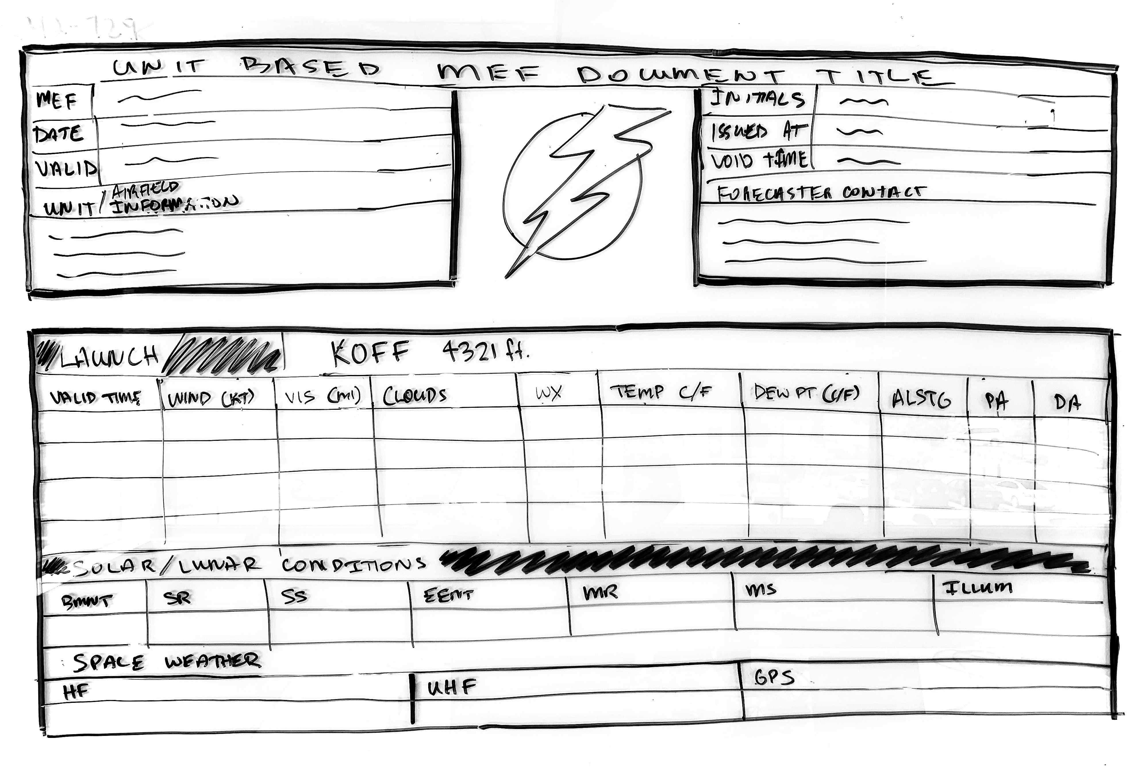
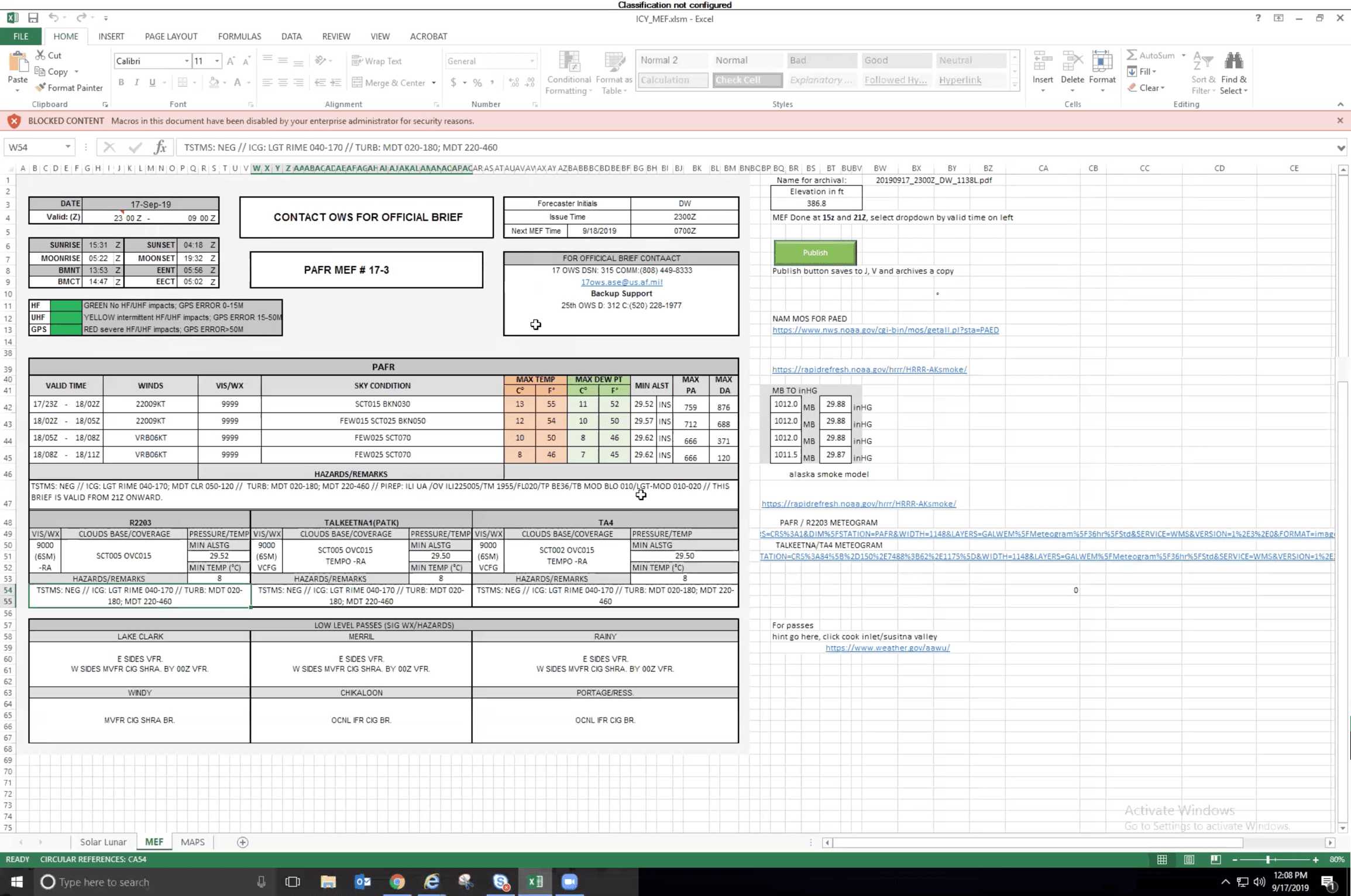
Data Requirements & Information Architecture
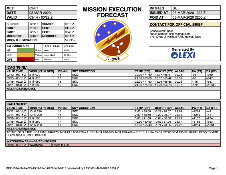
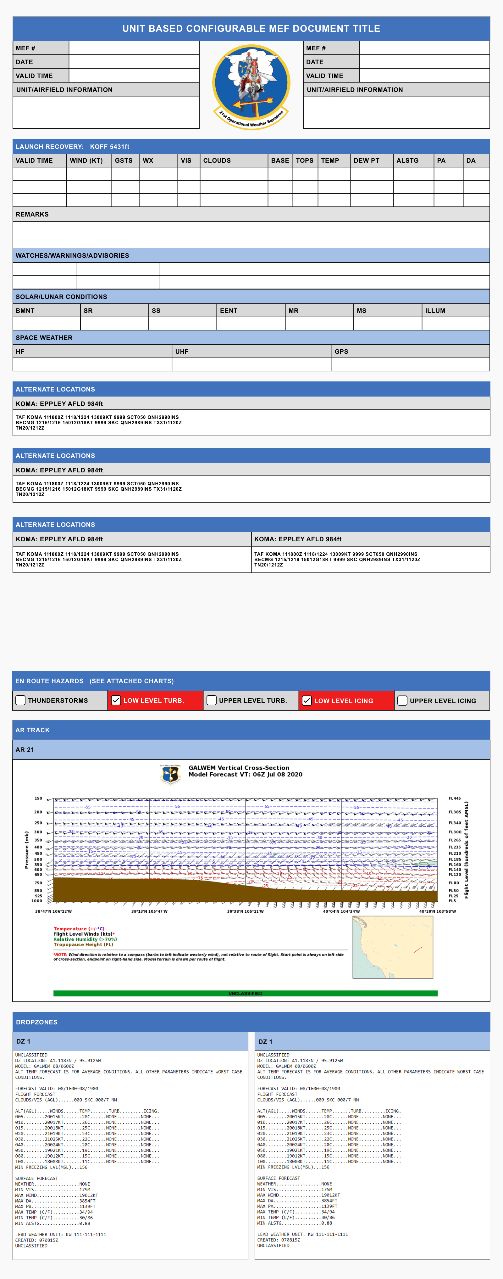
I conducted whiteboarding sessions during forecaster interviews to identify all data types to begin conceptualizing a standard output template. I also mapped all user inputs and data to and established the information architecture requirements necessary for forecast construction. Progressive refinement stages of the forecast template are shown in the following images:
Whiteboarding the forecast output template:
Prototyped versions for validation testing:
Post-validation testing and refinement:
Research
Prototyping
Testing
Refinement
Hand-Off
Rapid Low-Fidelity Prototyping
Leveraging requirements based on the forecaster research and validated with project stakeholders, I mapped information architecture and designed a lo-fi rapid prototype for the primary journey of building a forecast. I leveraged a Figma UI kit that included minimal styling to focus the initial design effort and subsequent testing feedback on discoverability, usability, and functionality.
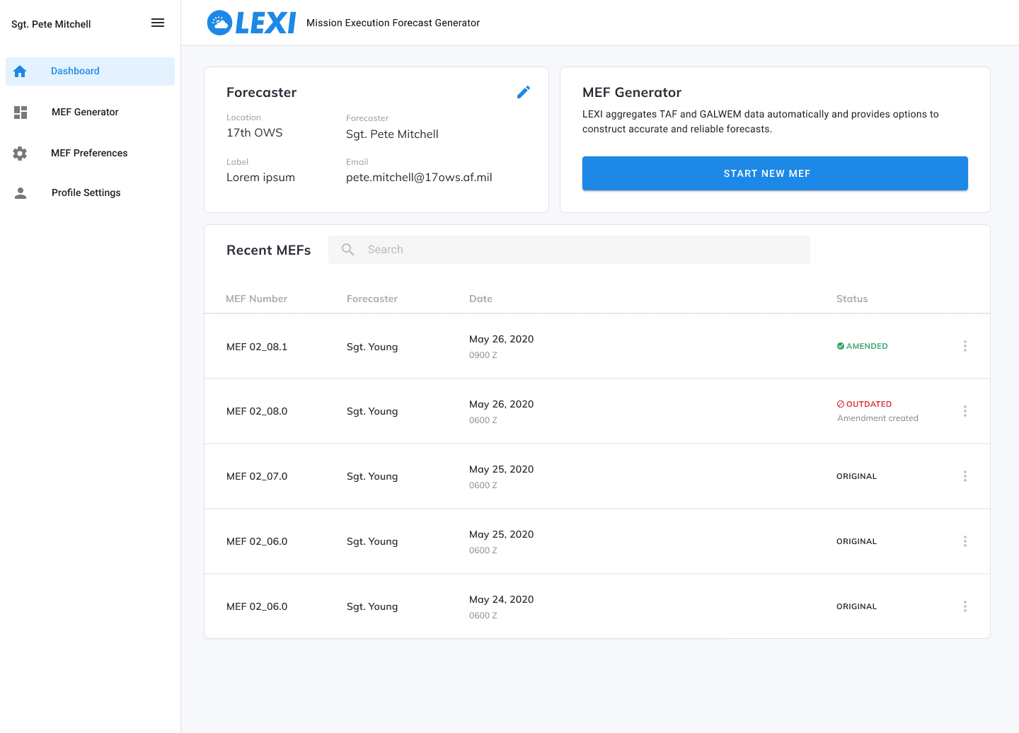
Dashboard
Section Index
Location Data
Research
Prototyping
Testing
Refinement
Hand-Off
Prototype Testing with Forecasters
I conducted prototype testing sessions to gather feedback from forecasters on the design approach to building a forecast. This feedback resulted in a list of potential improvements that I synthesized with my team and validated with DoD stakeholders before refining the design. My favorite squadron was the 115th based in Oahu, Hawaii for obvious reasons. Our team got the opportunity to travel there to observe forecasters and conduct prototype testing (the photo below was taken in the squadron's conference room where we conducted testing).

DoD Stakeholder
Forecaster
Forecaster
Research
Prototyping
Testing
Refinement
Hand-Off
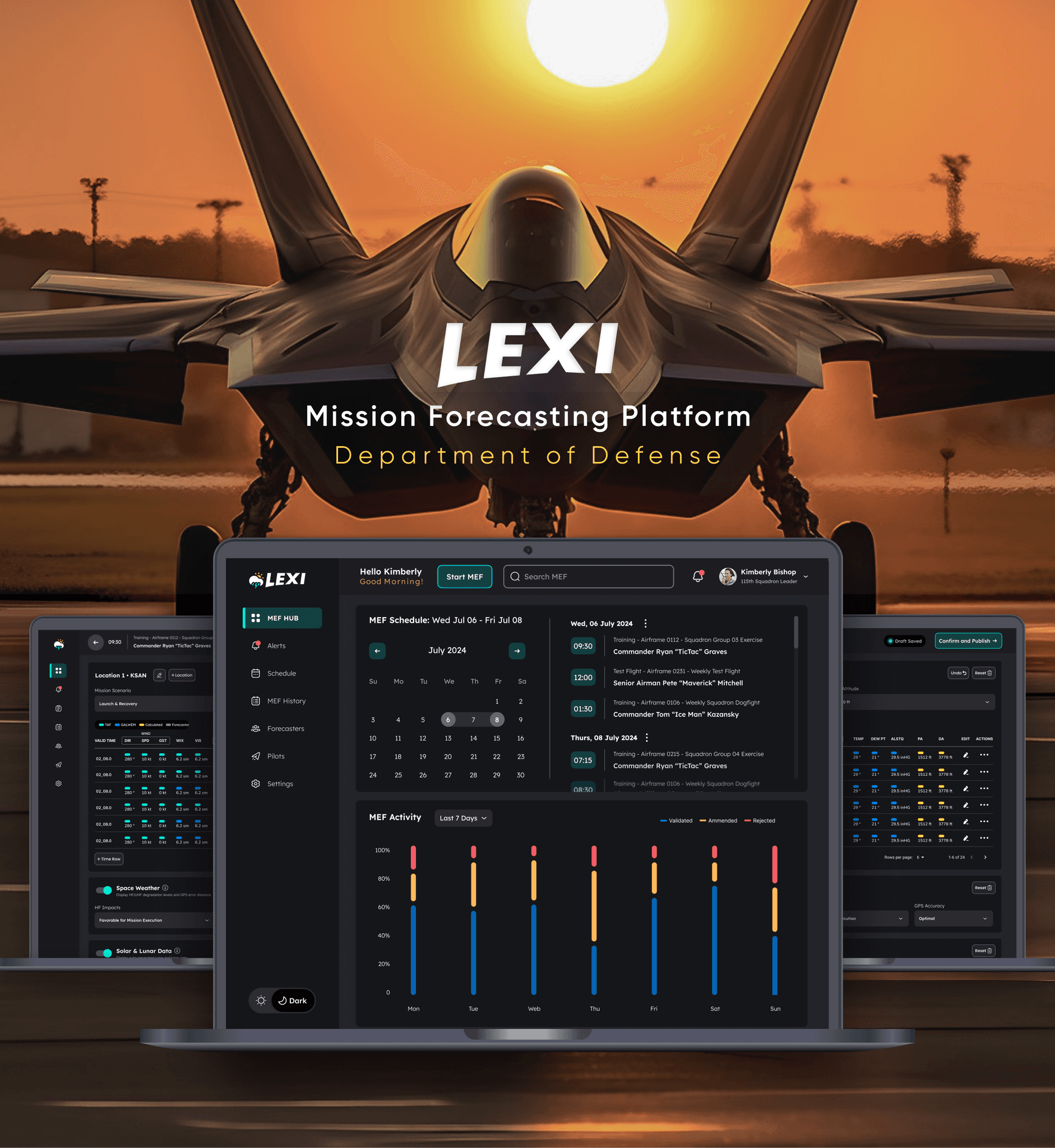
Login and Dashboard Experience
Pain points identified during my interviews with squadron leaders informed the login and dashboard design requirements,
The dashboard design included a forecast schedule viewer that allowed forecasters to launch a new forecast that imported all of the high-level mission data automatically. I also included a forecast performance module to provide high-level visual analytics related to forecast performance.
These pain points included:
The time required in moving between siloed systems to view forecast schedules.
The opportunity for error and time involved in manually inputing info from the scheduler into the forecast.
The lack of a simple visual representation of percentages of amended and error-rejected forecasts to highlight performance related trends.
Phase 1
Phase 2
Phase 3
Notes on dashboard MVP approach: Although the eventual plan for an interface tailored specifically for forecast leaders was not included in our initial project contract, my goal for the dashboard was to create an MVP design that benefited both forecasters and squadron leaders. The forecast scheduler imported data from the squadron calendar alongside a date picker to quickly look ahead and use as an alternative method of viewing past forecast events, mirroring common use-case scenarios of the current calendar system.
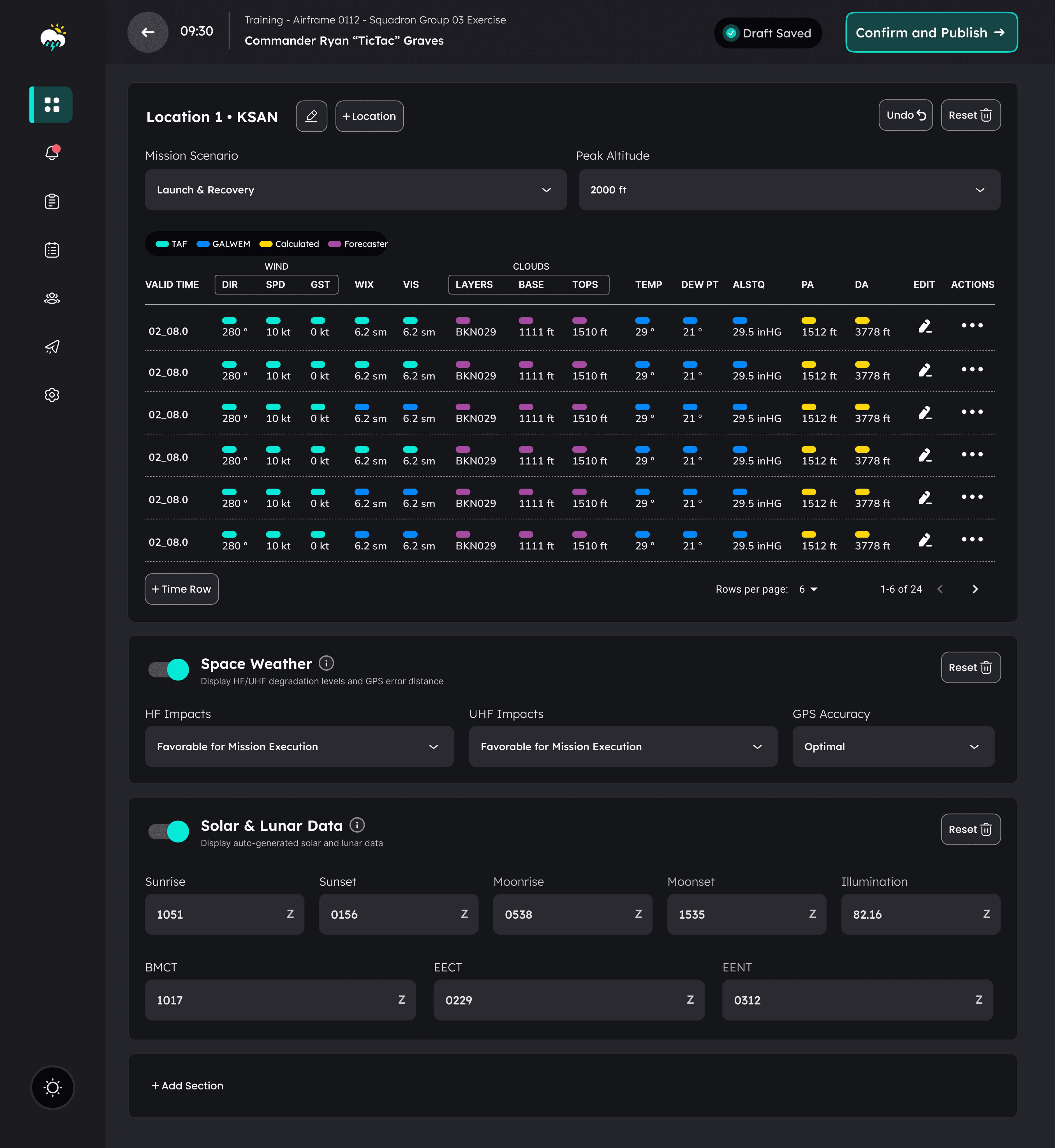
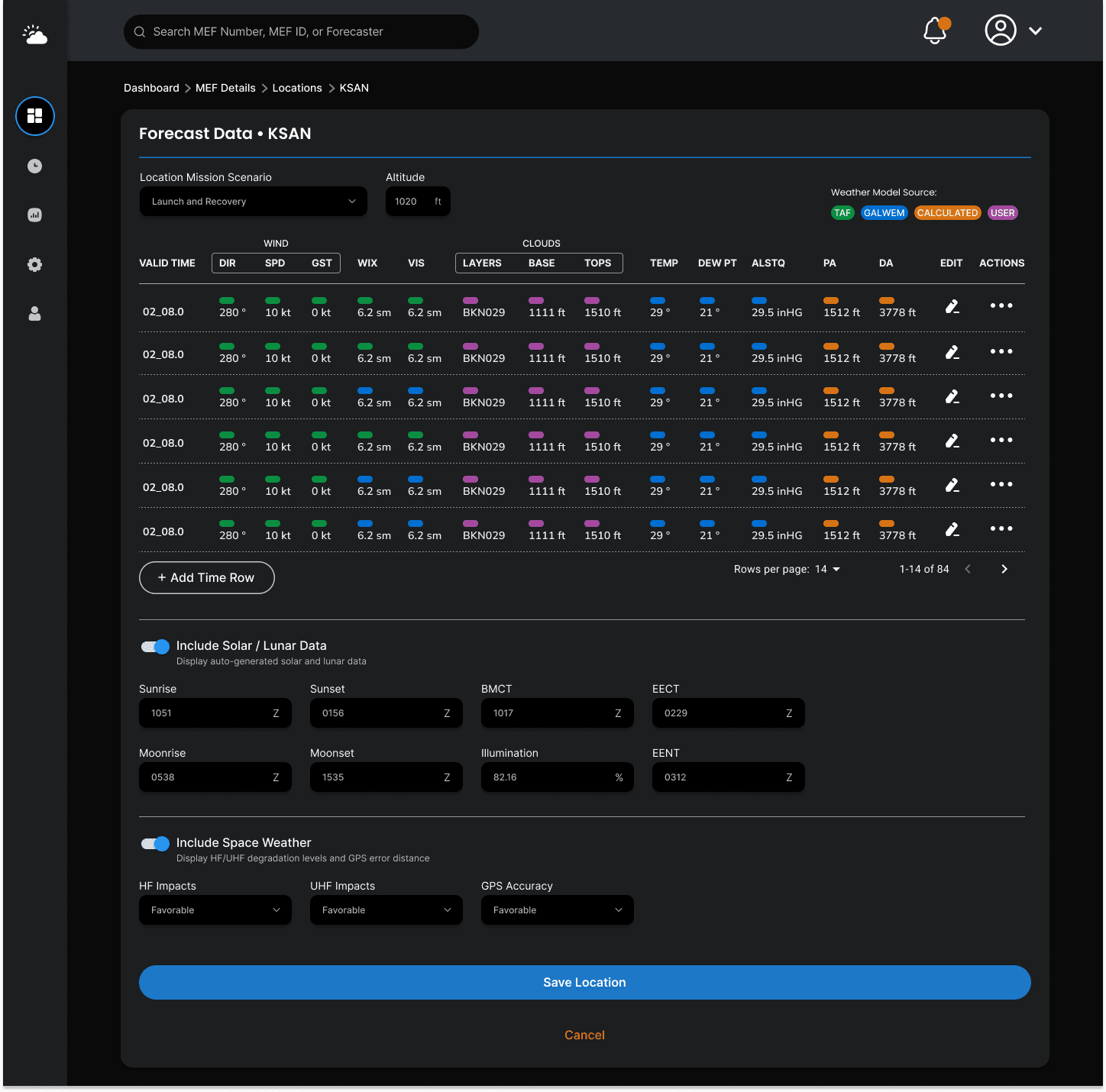
Refining the Forecast Builder
Through multiple rounds of prototyping-testing-refinement sprints, I gathered valuable feedback that informed the refinement of the design along the way. This phased progression included the following improvements based on testing feedback:
Information Architecture
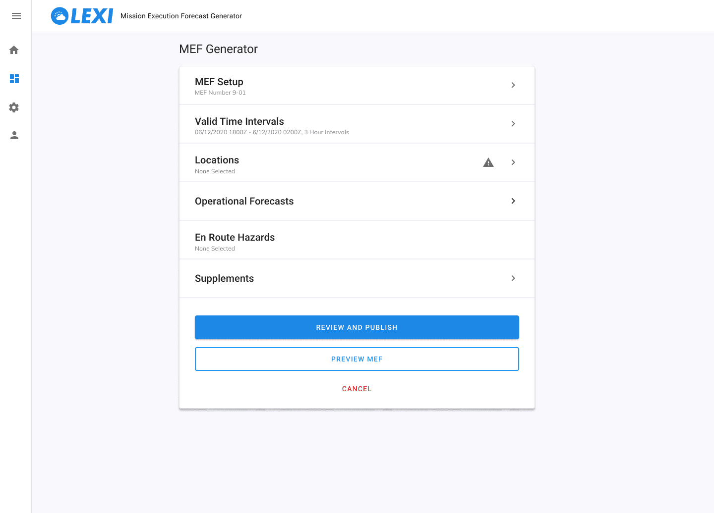
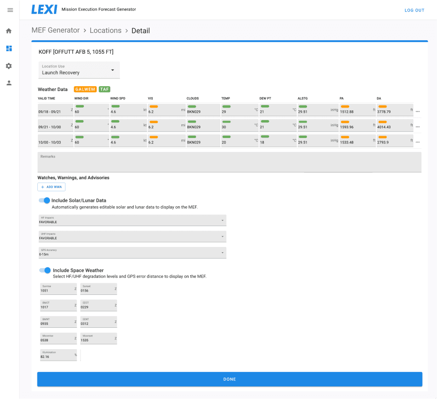
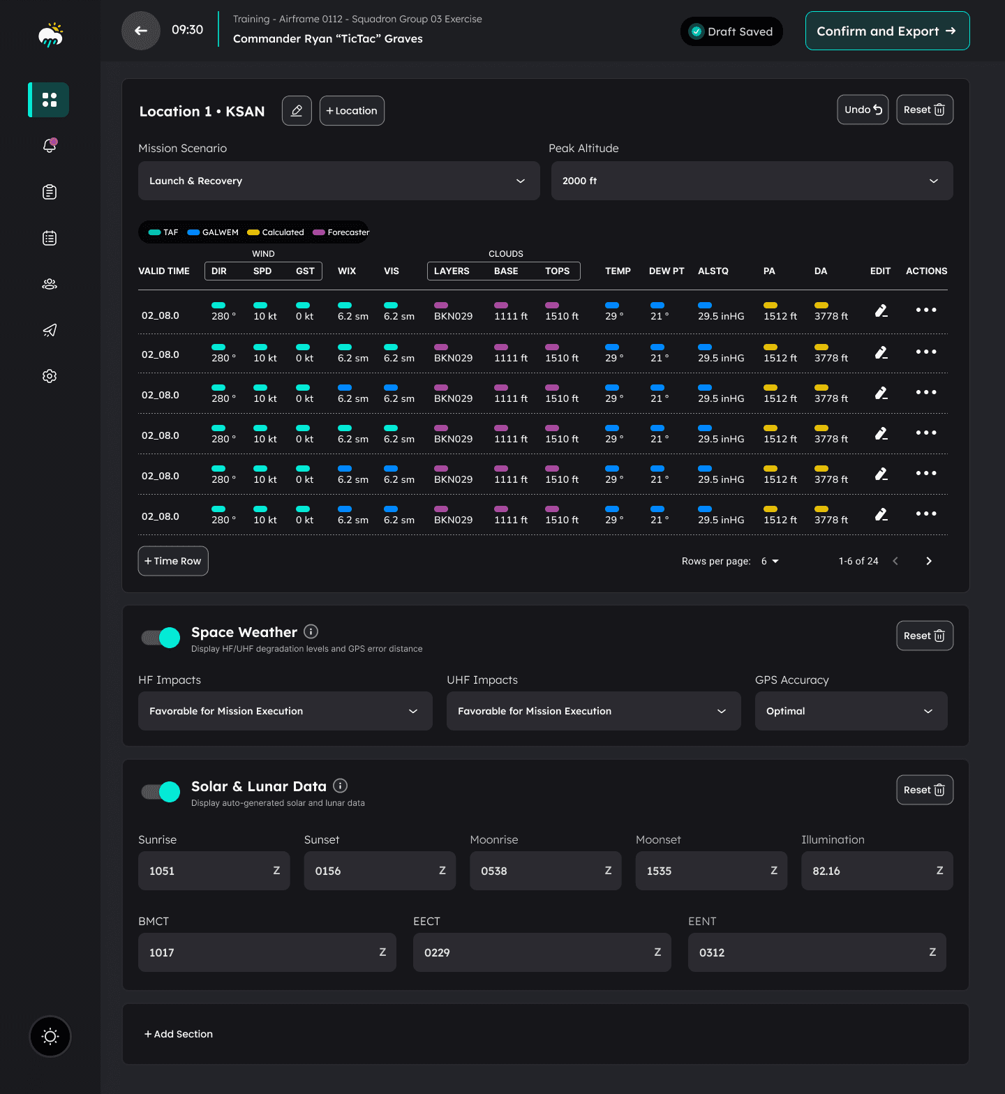
During prototype testing I learned that treating supplemental attachments and data as separate sections of the forecast was a process pain point due to current tool limitations. Forecasters preferred a more dynamic approach by constructing and editing all data and attachments related to a given forecast in one scrollable view, rather than needing to tab or nav into separate sections. I learned that forecasters frequently forgot about other sections of the forecast before exporting, so this approach helped reduce error by making it easier to review and confirm the full forecast in one place. This also made validation and editing easier downstream in the journey.
Additional Data Indicators
Although I confirmed that GALWEM and TAF data sources were the correct priority weather models, testers pointed out that they needed a way to refer to data that was edited, added, or changed. There was also scenarios where specific weather data wasn’t available, and these values were commonly calculated based on other available data from TAF or GALWEM. This feedback led to the addition of the yellow “Calculated” and purple “Forecaster” indicators in the final design.
Draft Status
Testers expressed that they would benefit from a status indicating “draft saved” to offer them peace of mind, especially when they needed to shift focus to another task before the forecast was completed.
“Undo” Feature
When making edits to the forecast values, testers desired the ability to quickly undo their last change, similar to the undo function that they commonly used when creating the forecast in an excel file.
Dark Mode
Testers expressed that a dark theme was preferred in the final design to help reduce eye strain, with the benefit of also differentiating the LEXI screen against the weather models they commonly had pulled up on additional screens while constructing the forecast.
Phase 1
Phase 2
Phase 3
Streamlining Information Architecture
In order to streamline information architecture and make it possible to construct and review the entire forecast in a single modular scroll view, I introduced overlays for adding sections like operational data, en-route hazards, MOAFs (operational areas), and DropZones (for missions that include regional windows for paratrooper deployment).

Research
Prototyping
Testing
Refinement
Hand-Off
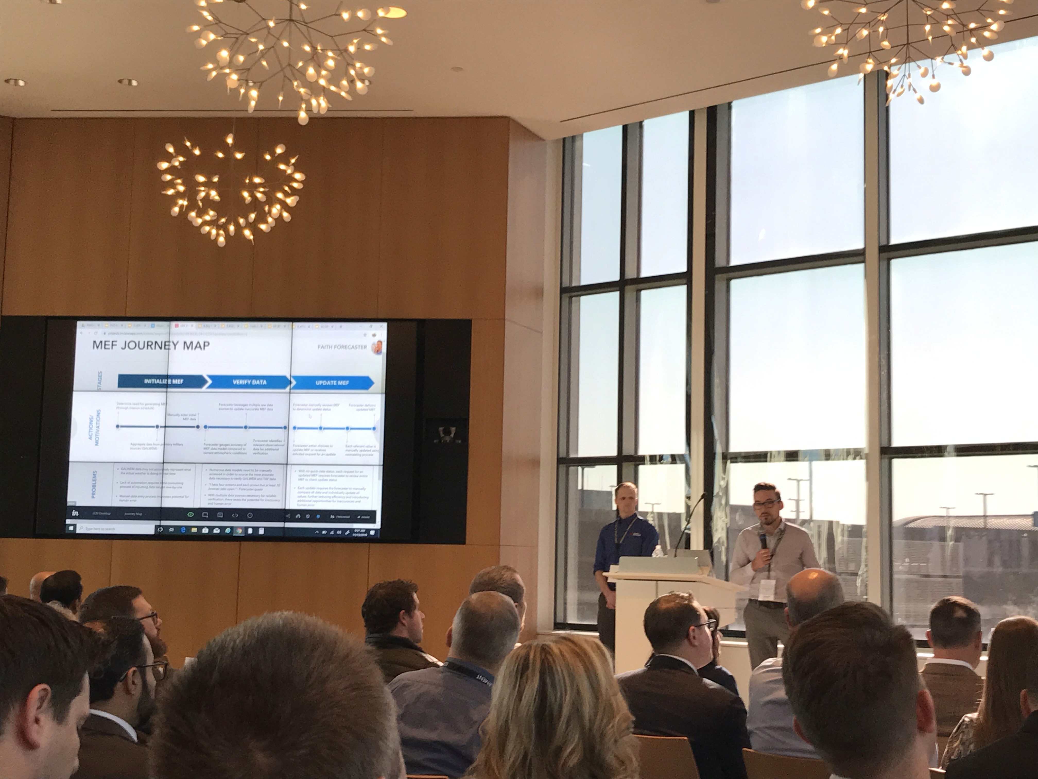
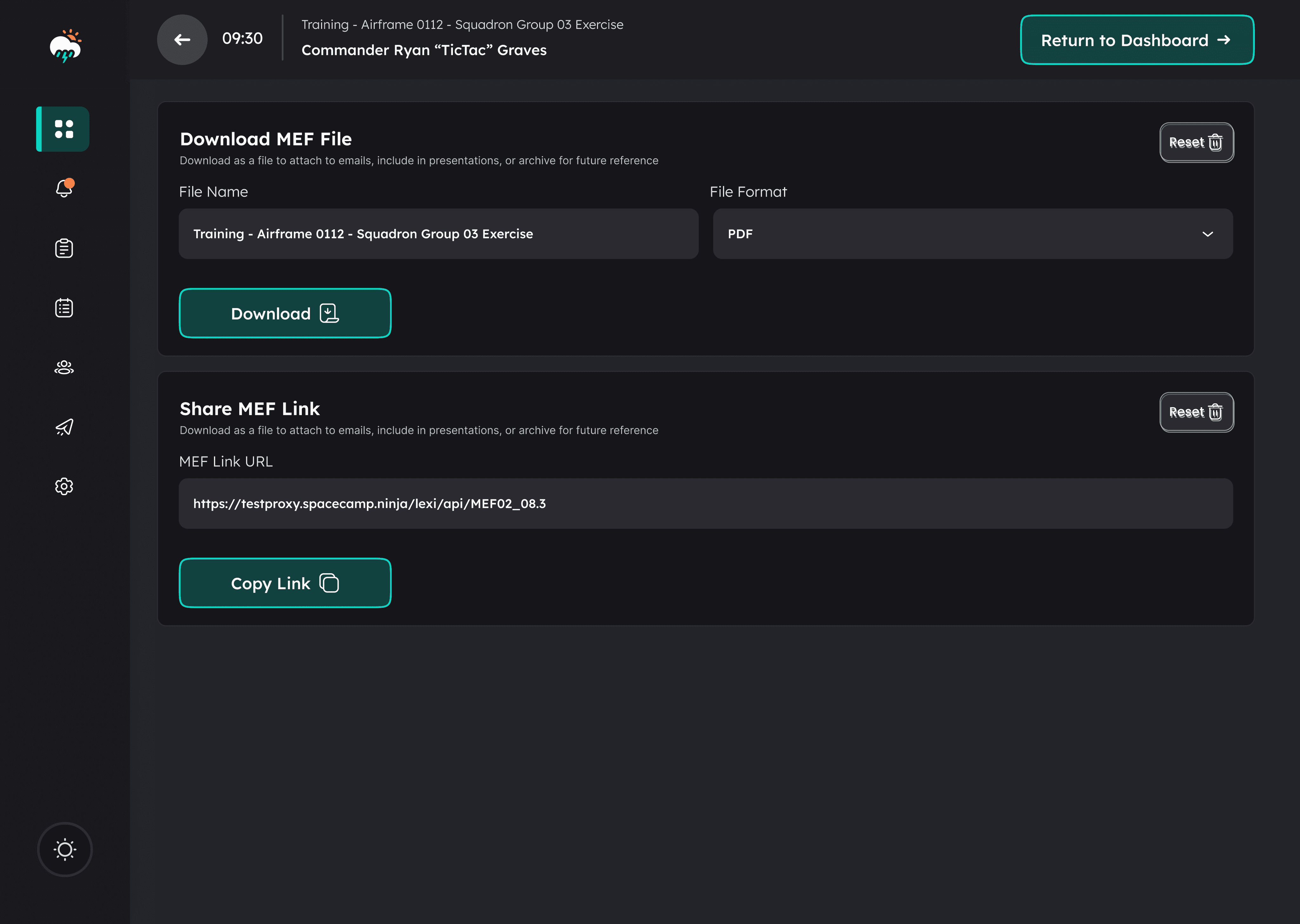
Department of Defense Hand-Off
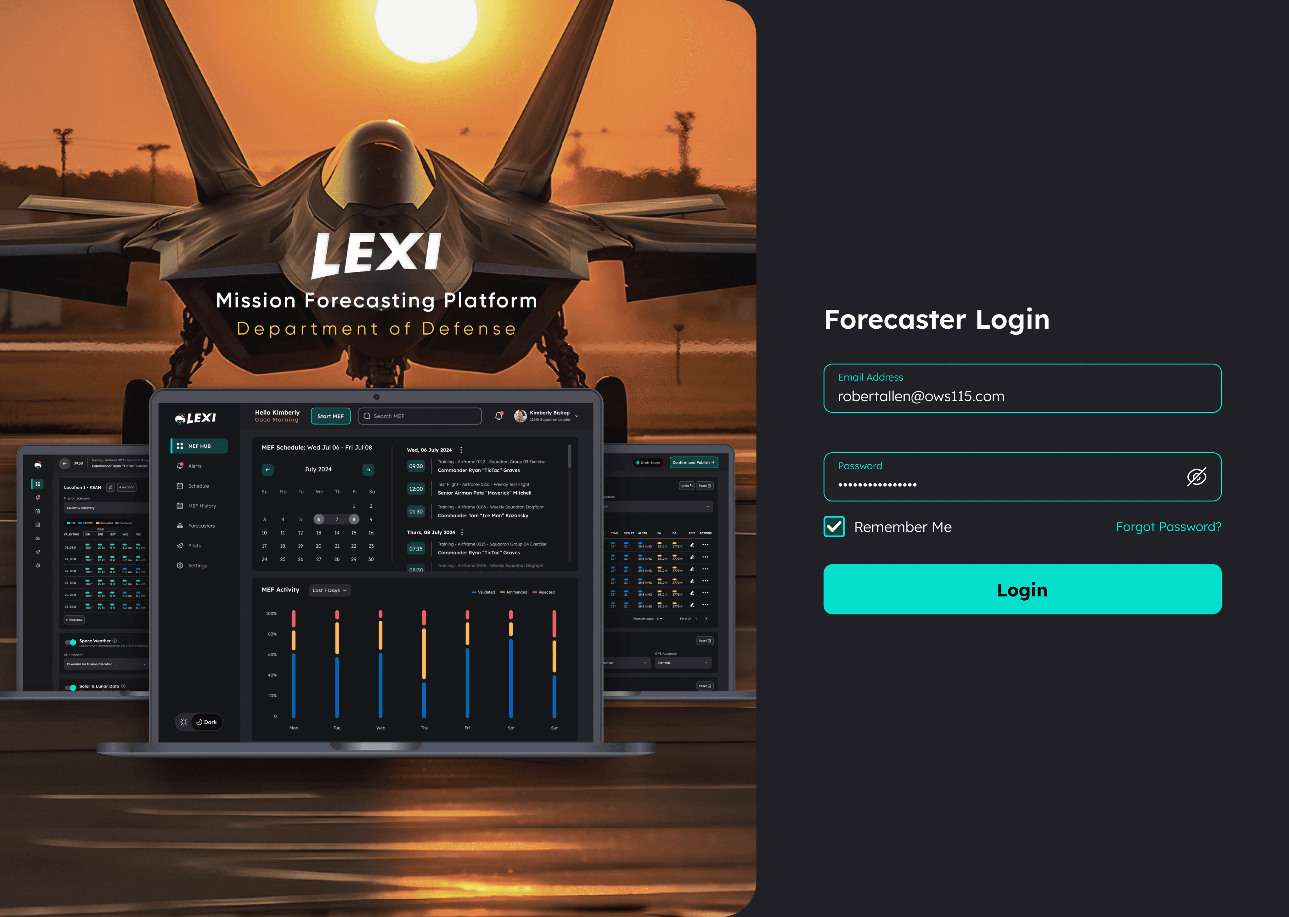
In order to maximize the likelihood of LEXI adoption across all weather squadrons in both the Air Force and Army, it was important to evangelize the product with DoD leadership. As the contract was winding down, our team travelled to Washington D.C. to present the LEXI product at the Department of Defense LevelUp Conference. I had the opportunity to present the research, prototyping, and testing initiative that led to the final design. The reception was excellent and our team left the conference feeling confident that DoD leadership was excited about LEXI and recognized it's ability to dramatically improve efficiency and accuracy of mission forecasting.
Problems Reported by Department of Defense
Of all pilot fatalities resulting from incidents involving weather, 85% could be avoided with faster and more accurate weather reporting.
99% of weather reporting errors are due to human error by way of inaccurate manual aggregation of source model data by forecasters.
Flight accidents involving rapidly evolving inclement weather scenarios result in costs that exceed $2 million annually.
Problems Reported by Weather Squadrons:
The current process for issuing mission-specific weather reports and alerts to pilots is outdated and fragmented across all squadrons and involves a slow and human-error prone process of copying and pasting data from multiple data models into excel spreadsheets.
This outdated forecasting process makes it extremely difficult for forecasters to support pilots with accurate and timely data and introduces avoidable risk during inclement and rapidly evolving weather.
A highly usable and standardized weather data aggregation and reporting system is necessary to ensure pilot safety during advanced flight missions common to the modern-day military.
Research
Prototyping
Testing
Refinement
Hand-Off
Forecaster Interviews & Heuristic Observation
To kick off the research phase I conducted a UX Interview and Heuristics Study with 20 Air Force forecasters from US weather squadrons (both domestic and international). The high-level discovery goals were summarized as follows:
Understand the current forecast generation process, steps involved in building the forecast, and identify all pain points and gaps related to the outdated tool sets and any areas where human error is being introduced.
Document all standard, conditional and supplemental data as well as the model and source of all weather data required to support all forecast scenarios.
Uncover all potential mission scenarios and requirements that impact the forecast information and data (mission type, aircraft type, multiple locations, etc).
Investigate standard delivery method to pilots as well as pilots/DoD's forecast-output format expectations and requirements (and whether these conflict and for what reasons).
Journey Mapping
I created the Forecast Journey Map shown below in order to contextualize the problems and opportunities I discovered related to each process and stage of the forecast creation and validation process. This map served as a powerful reference point to focus and prioritize design decisions as well as summarize the research findings for the internal team and external DoD stakeholders.
Data Requirements & Information Architecture
I conducted whiteboarding sessions during forecaster interviews to identify all data types to begin conceptualizing a standard output template. I also mapped all user inputs and data to and established the information architecture requirements necessary for forecast construction. Progressive refinement stages of the forecast template are shown in the following images:
Whiteboarding the forecast output template:
Prototyped versions for validation testing:
Post-validation testing and refinement:
Research
Prototyping
Testing
Refinement
Hand-Off
Rapid Low-Fidelity Prototyping
Leveraging requirements based on the forecaster research and validated with project stakeholders, I mapped information architecture and designed a lo-fi rapid prototype for the primary journey of building a forecast. I leveraged a Figma UI kit that included minimal styling to focus the initial design effort and subsequent testing feedback on discoverability, usability, and functionality.
Research
Prototyping
Testing
Refinement
Hand-Off
Prototype Testing with Forecasters
I conducted prototype testing sessions to gather feedback from forecasters on the design approach to building a forecast. This feedback resulted in a list of potential improvements that I synthesized with my team and validated with DoD stakeholders before refining the design. My favorite squadron was the 115th based in Oahu, Hawaii for obvious reasons. Our team got the opportunity to travel there to observe forecasters and conduct prototype testing (the photo below was taken in the squadron's conference room where we conducted testing).

Research
Prototyping
Testing
Refinement
Hand-Off
Forecast Builder - Refining the Design
Through multiple rounds of prototyping-testing-refinement sprints, I gathered valuable feedback that informed the refinement of the design along the way. This phased progression included the following improvements based on testing feedback:
Information Architecture
During prototype testing I learned that treating supplemental attachments and data as separate sections of the forecast was a process pain point due to current tool limitations. Forecasters preferred a more dynamic approach by constructing and editing all data and attachments related to a given forecast in one scrollable view, rather than needing to tab or nav into separate sections. I learned that forecasters frequently forgot about other sections of the forecast before exporting, so this approach helped reduce error by making it easier to review and confirm the full forecast in one place. This also made validation and editing easier downstream in the journey.
Additional Data Indicators
Although I confirmed that GALWEM and TAF data sources were the correct priority weather models, testers pointed out that they needed a way to refer to data that was edited, added, or changed. There was also scenarios where specific weather data wasn’t available, and these values were commonly calculated based on other available data from TAF or GALWEM. This feedback led to the addition of the yellow “Calculated” and purple “Forecaster” indicators in the final design.
Draft Status
Testers expressed that they would benefit from a status indicating “draft saved” to offer them peace of mind, especially when they needed to shift focus to another task before the forecast was completed.
“Undo” Feature
When making edits to the forecast values, testers desired the ability to quickly undo their last change, similar to the undo function that they commonly used when creating the forecast in an excel file.
Dark Mode
Testers expressed that a dark theme was preferred in the final design to help reduce eye strain, with the benefit of also differentiating the LEXI screen against the weather models they commonly had pulled up on additional screens while constructing the forecast.
Phase 1:
Phase 2:
Phase 3:
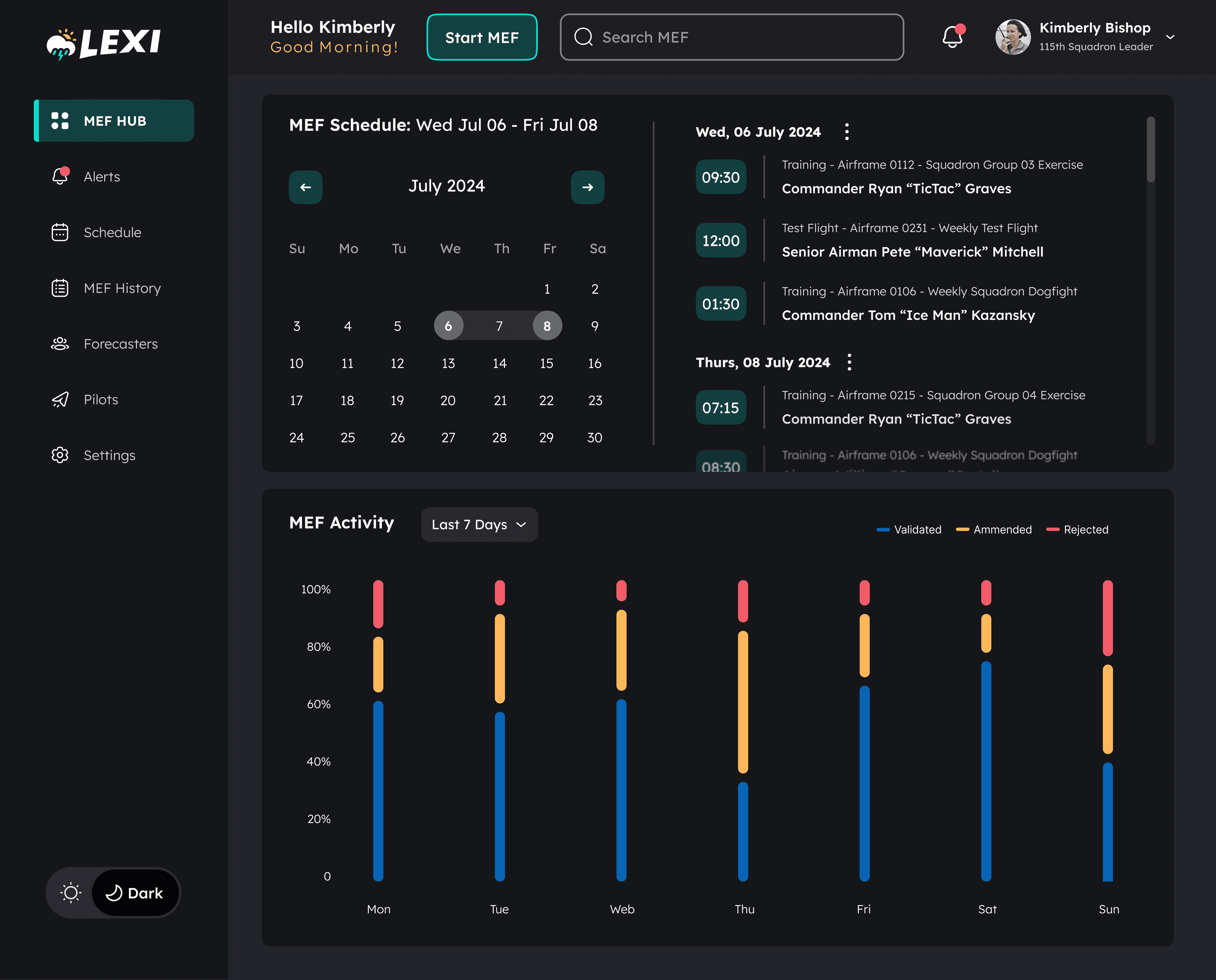
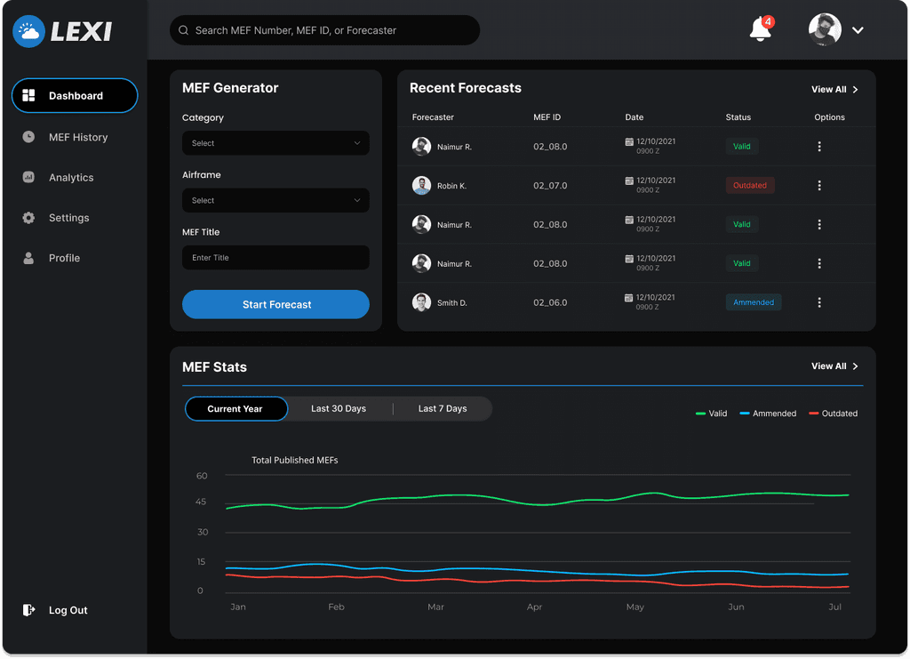
Dashboard Design
Pain points identified during my interviews with squadron leaders informed the dashboard design requirements, which included a forecast schedule viewer and a forecast activity module providing high level visual analytics related to forecast performance. These pain points included:
The time required in moving between siloed systems to view forecast schedules.
The opportunity for error and time involved in manually inputing info from the scheduler into the forecast.
The lack of a simple visual representation of percentages of amended and error-rejected forecasts to highlight performance related trends.
Notes on dashboard MVP approach: Although the eventual plan for an interface tailored specifically for forecast leaders was not included in our initial project contract, my goal for the dashboard was to create an MVP design that benefited both forecasters and squadron leaders. The forecast scheduler imported data from the squadron calendar alongside a date picker to quickly look ahead and use as an alternative method of viewing past forecast events, mirroring common use-case scenarios of the current calendar system.
Phase 1:
Phase 2:
Phase 3:
Research
Prototyping
Testing
Refinement
Hand-Off
Department of Defense Hand-Off
In order to maximize the likelihood of LEXI adoption across all weather squadrons in both the Air Force and Army, it was important to evangelize the product with DoD leadership. As the contract was winding down, our team travelled to Washington D.C. to present the LEXI product at the Department of Defense LevelUp Conference. I had the opportunity to present the research, prototyping, and testing initiative that led to the final design. The reception was excellent and our team left the conference feeling confident that DoD leadership was excited about LEXI and recognized it's ability to dramatically improve efficiency and accuracy of mission forecasting.