

Project Background & Goals
EGV3 is a health-tech sensor system developed for monitoring, tracking and managing blood glucose for users with insulin-related health conditions.
As sole lead designer on the project, I worked directly with project stakeholders to accomplish the conceptualize a design pattern for the app that maximized intuitive comprehension of data related to:
Estimated Glucose Value (EGV): Measured in in mg/dL
EGV Range (High, In-Range, or Low): These 3 standard glucose ranges are defined by threshold values provided to the user by their clinician
Direction and Rate of Change (ROC): Used in context with the user's current EGV, indication of a rising or falling EGV and how rapidly the change is occuring is critical information to determine the proper immediate course of action (if any)
Concept
Research
Design
Testing
Hand-Off
Research
Design
Concept
Testing
Research
Concept
Design
Testing
Competitor Analysis
I tested market-leading glucose tracking apps, focusing my analysis on aspects related to:
Discoverability & Affordance
Information Architecture & Navigation
Customer Reviews & Feedback (from publicly available sources like app-store ratings and Reddit forums)
Shared Core Features
Differentiating design patterns and innovative concepts
Clinical User Research
I analyzed clinical user segments and interviewed multiple diabetes experts and diabetics with the goal of understanding the different types of insulin-related conditions and associated needs and pain points when monitoring blood glucose. To define each user segment I identified correlating patterns related to:
Insulin-related condition
Time since diagnosis
Clinical management programs/recommendations
Clinical program implementation struggles/challenges
Psychological profile
General lifestyle patterns
iOS/Apple Watch familiarity/usage
Discovery insights confirmed to me that current products in the market commonly lacked an intuitive experience for representing glucose levels and rate of change of increasing or decreasing levels. These insights highlighted the importance of maximizing the intuitive nature and ease-of-comprehension of related visual design patterns to eventually stand out in the market with a game-changing design and attract users and clinicians to the product.
After presenting research findings to company stakeholders, I lead a series of collaborative concept workshops to identify product goals based on customer need, define high-level requirements and prioritize MVP scope, map information architecture, and rapidly brainstorm design ideas and concepts. During team workshops I always record the session and move quickly to keep the discussion and idea flow unimpeded.
Home Dashboard Experience
I began the high fidelity design process with the Home Dashboard since it involved primary design elements that would carry over to 2 of the 3 other parent features of the app, which included the trendgraph and stats feature. Drawing from the concept workshops, the home dashboard design involved design-thinking and refinement of the following:
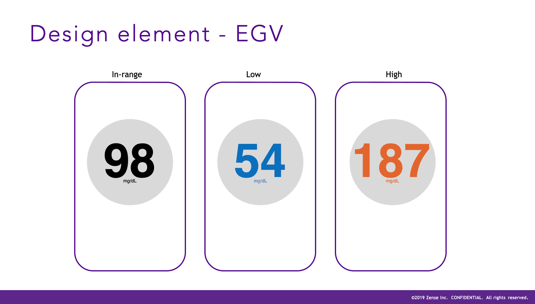
Estimated Glucose Value (EGV)
EGV Threshold Status (In-Range, High, or Low)
Rate of Changing EGV
Trendgraph & Stats Quickviews
Design Considerations & Approach
Stats Experience
Design Considerations & Approach
In order to achieve functional parity with the leading glucose tracking apps it was clear that the MVP needed to include a feature that allowed users to quickly learn how they were performing in terms of glucose stability. I designed and refined each component based on feedback:
Range Comparison - Bar vs Circle: During the refinement process, I designed a version that leveraged a horizontal bar that highlighted each glucose range percentage by expanding each section aligned with the comparative stats carousel below. This was clearly preferred by users that felt it was much easier to understand than the experience provided by other glucose tracking apps they'd used in the past, which commonly used a circular or "ring" style breakdown. This ring style is better leveraged and more commonly used for completion status, as seen natively ion Apple Watch component designs.
Comparative Stats Carousel: Users expressed the need to compare a given timeframe with the previous timeframe to quickly gain context on their current glucose stability performance. The goal was to provide these comparisons on a high level to minimize complexity and surface the most important metrics in an intuitive manner.
Time Parameters: Based on user and clinician feedback, I included timeframe of 24 hrs, 7 days, and 30 days. Clinicians expressed that these timeframes were the most helpful in gaining quick insights that assisted them in monitoring the progress of their patients.
Points & Rewards Feature
Design Considerations & Approach
During the design thinking exploration process, I built out a concept for a points & rewards platform to encourage positive behavioral modification, primarily driven to incentivize users to maximize their time spent in-range. The points and rewards design concept was also intended to encourage exploration and engagement with advanced app features like alert scheduling.
Glucose Stats Experience


Testing outcome
The testing process informed some general opportunities for improvement which were incorporated in the designs shown in this case study. The findings demonstrated a high level of usability and exceeded the standard requirements for FDA approval.
Validation Testing & FDA Approval
In order to achieve functional parity with the leading glucose tracking apps it was clear that the MVP needed to include a feature that allowed users to quickly learn how they were performing in terms of glucose stability. I designed and refined each component based on feedback:
EGV value and EGV thresholds (discoverability and comprehension): Users must quickly and easily discover and comprehend their current blood glucose value, as well as whether their current value was in-range, high, or low based on their thresholds.
Sensor connection and sensor status (discoverability and comprehension): Users must easily be able to connect a new sensor, as well as comprehend the sensor warm up period. Once their sensor was connected, they must easily discover and comprehend the 3 sensor statuses (connected, expiring soon, and expired).
Alerts for EGV value, EGV rate of change, expiring sensor, and bluetooth disconnection (recognition and comprehension): Users must quickly and easily recognize and comprehend when their EGV value moved above or below their in-range threshold, when their sensor needed to be replaced or was expired, and when their bluetooth was disconnected (stopping all data transmission from the sensor).
One of the technical constraints I discovered during the conceptual design was that a new EGV sensor takes about 15 mins to warm up. Each sensor lasted for about 2 weeks and then needed to be discarded and replaced with a new one, with 2 sensor patches being shipped to the user every month. Because of this warm up period, I needed to create a design that made the following clear and intuitive:
Time-Remaining Status: How much life was remaining in a connected sensor
Replacement Status: a status for the sensor component letting the user know when their it was time to replace their sensor
Dead or Disconnected Sensor: a design for sensor status and main dashboard circle when a sensor was dead or disconnected
Warm Up Status: A status design for the sensor component and main dashboard circle for the 15 min warm up period to avoid confusion and anxiety about a newly applied sensor that wasn't yet displaying their glucose data
Design Considerations & Approach
Sensor Connection & Status
Research
Testing
Concept
Design
Estimated Glucose Value (EGV) and EGV Status (In-Range, High, or Low)
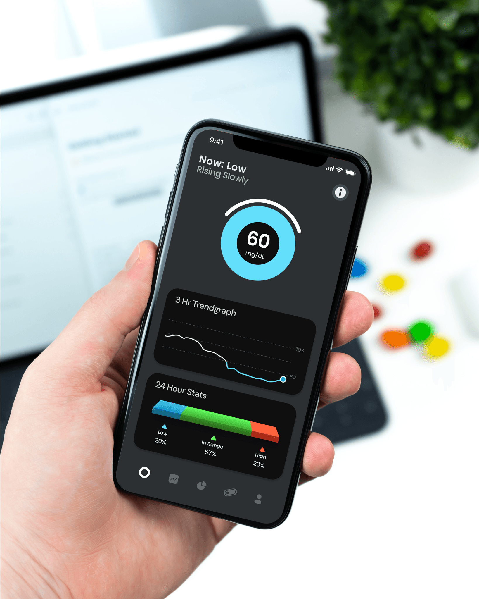
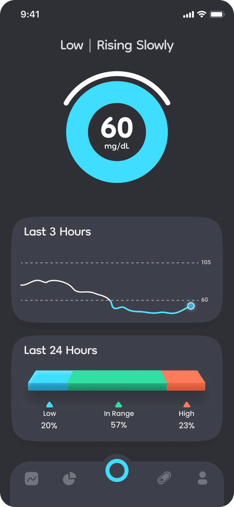
Color was a powerful tool I took advantage of to represent EGV. Drawing inspiration from temperature and stoplight color schemes, I designed the main circle to display a color that could intuitively represent all 3 EGV statuses.
Although the visual system to represent all EGV and ROC states was designed with simplicity and clarity in mind, users needed a quick way to view details about their current state. I designed a quick guide view, accessed via the info icon on the top right of the home screen. This approach scaled well across all possible EGV and ROC combinations.
Trendgraph & Stats Quickviews
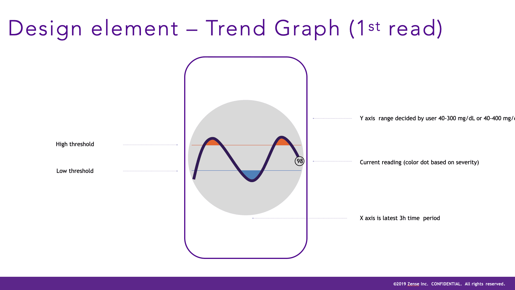
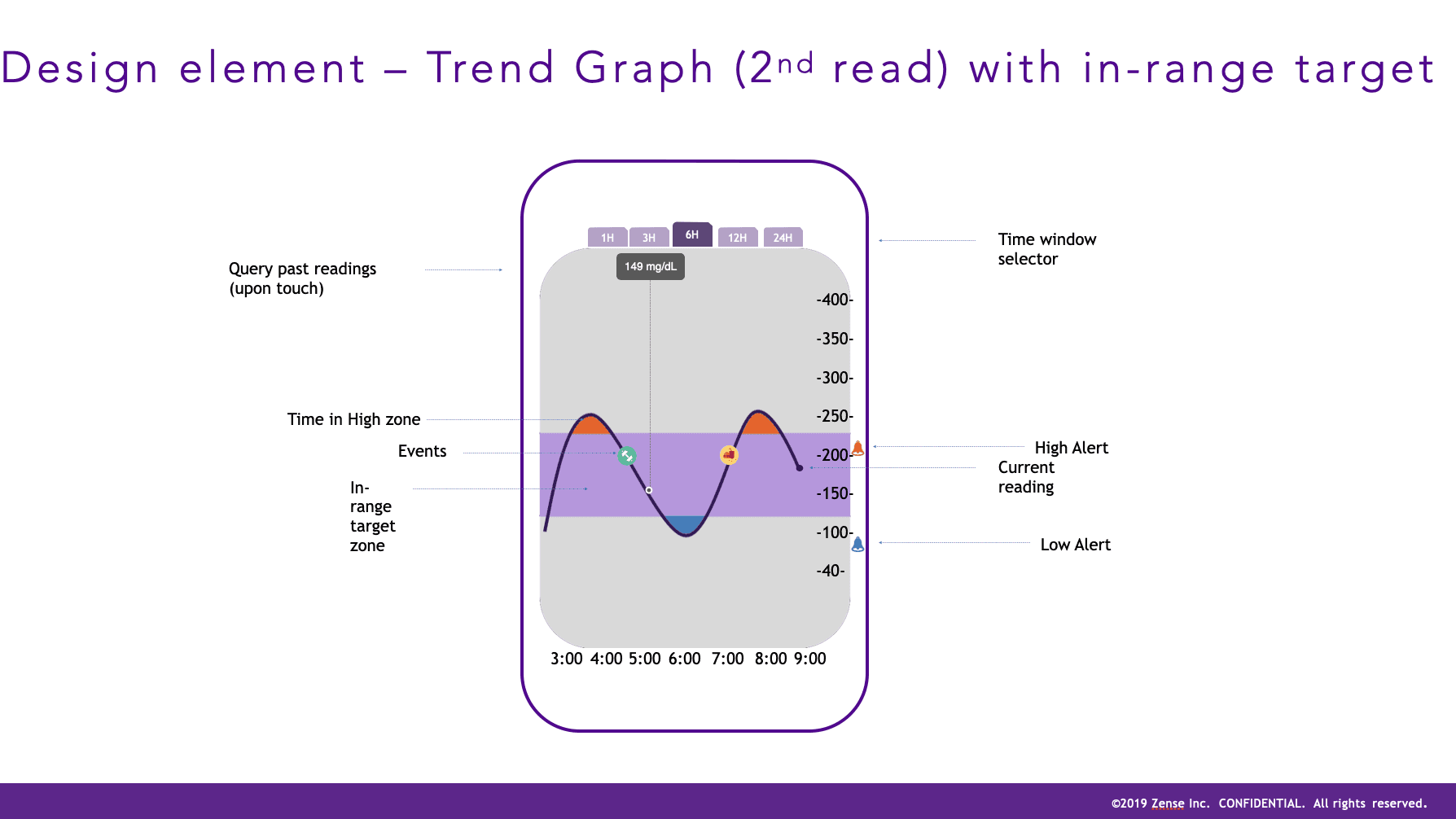
During the discovery phase I learned that in order to make quick decisions regarding eating, insulin, and exercise, users also needed a way to see how their glucose level was trending in the last 24 hrs as well as a quick comparison of how much time they spent in each glucose range. This finding lead to the design of a Trendgraph and Stats summary tile below the main circle, with each tile as an alternative to the navigation bar icons to link to the full Trendgraph or Stats screen.
Rate of Changing EGV
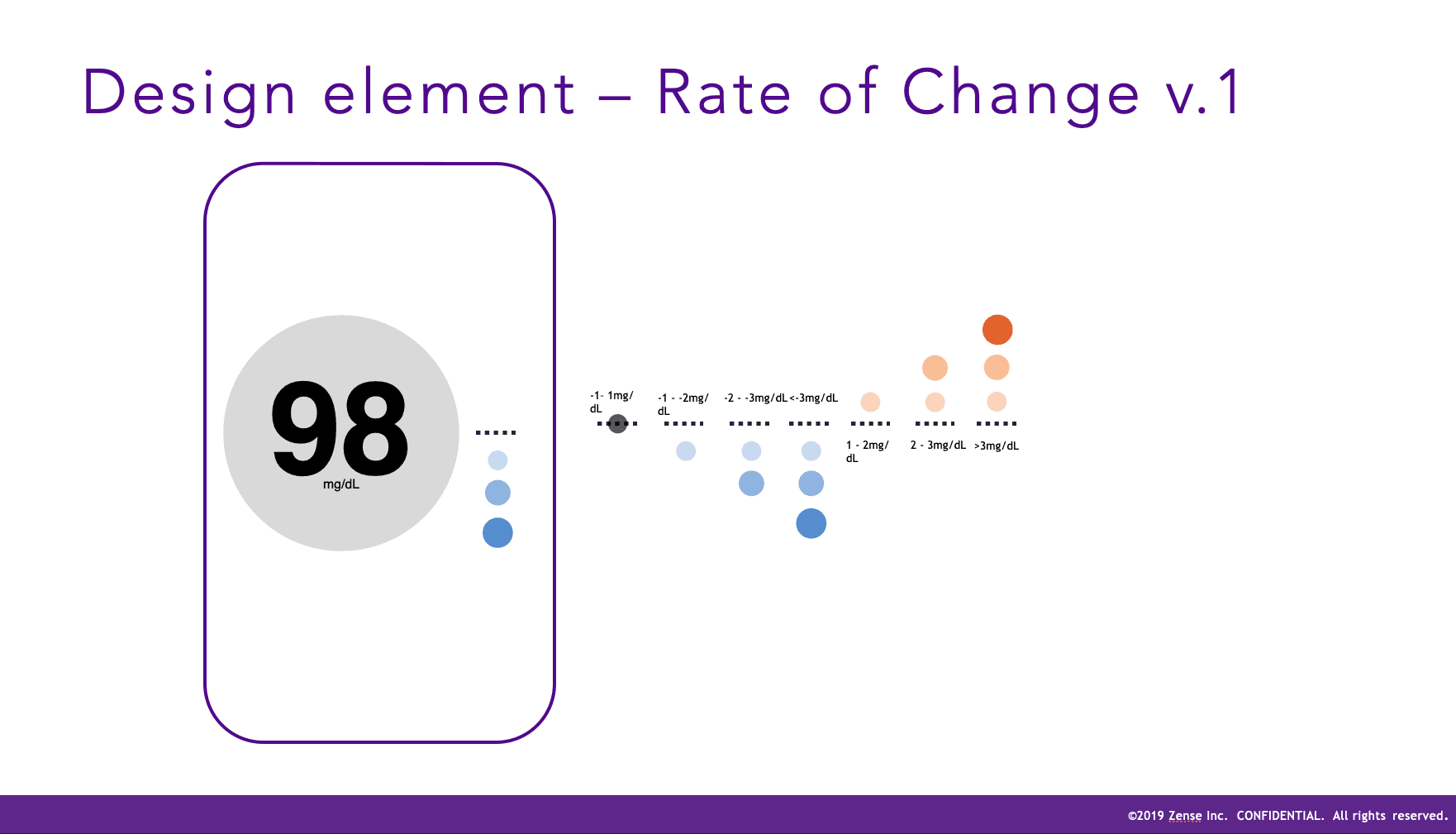
To convey direction and rate of changing EGV, the stakeholder team initially recommended a component horizontally aligned next to the center circle During iteration I evolved the concept and leveraged a simple and clear approach with pulsing directional arcs above and below the main circle, which reduced visual complexity and made better use of available screen real-estate. This also helped maintain design consistency given the limitations of Apple Watch This concept included:
A single pulsing arc above or below the main circle to represent a slowly rising or falling EGV (respectfully)
Double pulsing arcs above or below the main circle to represent a quickly rising or falling EGV (respectfully)
A single horizontal pulsing arc on either side of the main circle to represent a stable EGV
Project Background & Goals
EGV3 is a health-tech sensor system developed for monitoring, tracking and managing blood glucose for users with insulin-related health conditions. As sole lead designer on the project, I was given full creative license by project stakeholders to conceptualize a design pattern for the app that maximized intuitive comprehension and interaction with data related to:
Estimated Glucose Value (EGV) measured in in mg/dL
EGV Range (High, In-Range, or Low): These 3 standard glucose ranges are defined by threshold values provided to the user by their clinician
Direction and Rate of Change (ROC): Used in context with the user's current EGV, indication of a rising or falling EGV and how rapidly the change is occuring is critical information to determine the proper immediate course of action (if any)
Research
Concept
Design
Testing
Competitor Analysis
I tested market-leading glucose tracking apps, focusing my analysis on aspects related to:
Discoverability & Affordance
Information Architecture & Navigation
Customer Reviews & Feedback (from publicly available sources like app-store ratings and Reddit forums)
Shared Core Features
Differentiating design patterns and innovative concepts
Clinical User Research
I analyzed clinical user segments and interviewed multiple diabetes experts and diabetics with the goal of understanding the different types of insulin-related conditions and associated needs and pain points when monitoring blood glucose. To define each user segment I identified correlating patterns related to:
Insulin-related condition
Time since diagnosis
Clinical management programs/recommendations
Clinical program implementation struggles/challenges
Psychological profile
General lifestyle patterns
iOS/Apple Watch familiarity/usage
Discovery insights confirmed to me that current products in the market commonly lacked an intuitive experience for representing glucose levels and rate of change of increasing or decreasing levels. These insights highlighted the importance of maximizing the intuitive nature and ease-of-comprehension of related visual design patterns to eventually stand out in the market with a game-changing design and attract users and clinicians to the product.
Research
Concept
Design
Testing
Concept Workshopping
After presenting research findings to company stakeholders, I lead a series of collaborative concept workshops to identify product goals based on customer need, define high-level requirements and prioritize MVP scope, map information architecture, and rapidly brainstorm design ideas and concepts. During team workshops I always record the session and move quickly to keep the discussion and idea flow unimpeded.
Research
Concept
Design
Testing
Home Dashboard Experience
I began the high fidelity design process with the Home Dashboard since it involved primary design elements that would carry over to 2 of the 3 other parent features of the app, which included the trendgraph and stats feature. Drawing from the concept workshops, the home dashboard design involved design-thinking and refinement of the following:
Estimated Glucose Value (EGV)
EGV Threshold Status (In-Range, High, or Low)
Rate of Changing EGV
Trendgraph & Stats Quickviews
Estimated Glucose Value (EGV) and EGV Status (In-Range, High, or Low)
Color was a powerful tool I took advantage of to represent EGV. Drawing inspiration from temperature and stoplight color schemes, I designed the main circle to display a color that could intuitively represent all 3 EGV statuses.
Although the visual system to represent all EGV and ROC states was designed with simplicity and clarity in mind, users needed a quick way to view details about their current state. I designed a quick guide view, accessed via the info icon on the top right of the home screen. This approach scaled well across all possible EGV and ROC combinations.
Rate of Changing EGV
To convey direction and rate of changing EGV, the stakeholder team initially recommended a component horizontally aligned next to the center circle During iteration I evolved the concept and leveraged a simple and clear approach with pulsing directional arcs above and below the main circle, which reduced visual complexity and made better use of available screen real-estate. This also helped maintain design consistency given the limitations of Apple Watch This concept included:
A single pulsing arc above or below the main circle to represent a slowly rising or falling EGV (respectfully)
Double pulsing arcs above or below the main circle to represent a quickly rising or falling EGV (respectfully)
A single horizontal pulsing arc on either side of the main circle to represent a stable EGV
Trendgraph & Stats Quickviews
During the discovery phase I learned that in order to make quick decisions regarding eating, insulin, and exercise, users also needed a way to see how their glucose level was trending in the last 24 hrs as well as a quick comparison of how much time they spent in each glucose range. This finding lead to the design of a Trendgraph and Stats summary tile below the main circle, with each tile as an alternative to the navigation bar icons to link to the full Trendgraph or Stats screen.
Sensor Connection & Status
One of the technical constraints I discovered during the conceptual design was that a new EGV sensor takes about 15 mins to warm up. Each sensor lasted for about 2 weeks and then needed to be discarded and replaced with a new one, with 2 sensor patches being shipped to the user every month. Because of this warm up period, I needed to create a design that made the following clear and intuitive:
Time-Remaining Status: How much life was remaining in a connected sensor
Replacement Status: a status for the sensor component letting the user know when their it was time to replace their sensor
Dead or Disconnected Sensor: a design for sensor status and main dashboard circle when a sensor was dead or disconnected
Warm Up Status: A status design for the sensor component and main dashboard circle for the 15 min warm up period to avoid confusion and anxiety about a newly applied sensor that wasn't yet displaying their glucose data
Stats Experience
In order to achieve functional parity with the leading glucose tracking apps it was clear that the MVP needed to include a feature that allowed users to quickly learn how they were performing in terms of glucose stability. I designed and refined each component based on feedback:
Range Comparison - Bar vs Circle: During the refinement process, I designed a version that leveraged a horizontal bar that highlighted each glucose range percentage by expanding each section aligned with the comparative stats carousel below. This was clearly preferred by users that felt it was much easier to understand than the experience provided by other glucose tracking apps they'd used in the past, which commonly used a circular or "ring" style breakdown. This ring style is better leveraged and more commonly used for completion status, as seen natively ion Apple Watch component designs.
Comparative Stats Carousel: Users expressed the need to compare a given timeframe with the previous timeframe to quickly gain context on their current glucose stability performance. The goal was to provide these comparisons on a high level to minimize complexity and surface the most important metrics in an intuitive manner.
Time Parameters: Based on user and clinician feedback, I included timeframe of 24 hrs, 7 days, and 30 days. Clinicians expressed that these timeframes were the most helpful in gaining quick insights that assisted them in monitoring the progress of their patients.
Points & Rewards Feature
During the design thinking exploration process, I built out a concept for a points & rewards platform to encourage positive behavioral modification, primarily driven to incentivize users to maximize their time spent in-range. The points and rewards design concept was also intended to encourage exploration and engagement with advanced app features like alert scheduling.
Research
Concept
Design
Testing


Validation Testing & FDA Approval
I conducted design testing with users that included validation requirements for FDA approval. Although the FDA approval was important, my primary goal was to capture usability insights to identify any necessary enhancements for the MVP design prior to implementation. Below is an example of the aspects and goals included in the testing:
EGV value and EGV thresholds (discoverability and comprehension): Users must quickly and easily discover and comprehend their current blood glucose value, as well as whether their current value was in-range, high, or low based on their thresholds.
Sensor connection and sensor status (discoverability and comprehension): Users must easily be able to connect a new sensor, as well as comprehend the sensor warm up period. Once their sensor was connected, they must easily discover and comprehend the 3 sensor statuses (connected, expiring soon, and expired).
Alerts for EGV value, EGV rate of change, expiring sensor, and bluetooth disconnection (recognition and comprehension): Users must quickly and easily recognize and comprehend when their EGV value moved above or below their in-range threshold, when their sensor needed to be replaced or was expired, and when their bluetooth was disconnected (stopping all data transmission from the sensor).
Testing outcome
The testing process informed some general opportunities for improvement which were incorporated in the designs shown in this case study. The findings demonstrated a high level of usability and exceeded the standard requirements for FDA approval.